
Planning a wedding is an exciting experience, but it comes with many important details that must be carefully considered. One of the most crucial elements of wedding planning is the wedding card.
A well-designed wedding card not only provides essential information to your guests but also reflects your style and sets the tone for your special day.
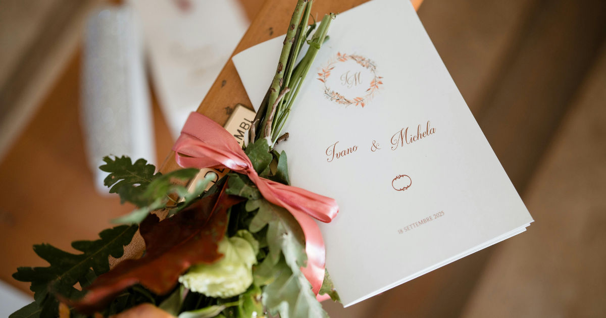
This guide explores the ideal wedding card format, layouts that make your cards easy to read, and tips for creating a card that impresses every recipient.
Importance of a Well-Designed Wedding Card
A wedding card is more than just an invitation; it is the first impression your guests will have of your wedding. A clear, organized layout ensures your guests can quickly understand the details of the event. Poorly formatted cards can cause confusion, leading to missed details or even wrong dates.
Key reasons why your wedding card format matters:
-
Ensures readability and comprehension
-
Reflects the couple’s personality and style
-
Provides guests with all necessary event information
-
Adds an aesthetic appeal that makes the invitation memorable
A wedding card with a thoughtful layout demonstrates attention to detail and helps set the stage for a smooth and enjoyable wedding experience.
Understanding the Components of a Wedding Card
Before deciding on a layout, it’s important to understand the key components that a wedding card typically includes. Organizing these elements logically will make the card easy to read.
1. Host Names
Traditionally, the names of the hosts appear at the top of the wedding card. These are often the parents of the bride or groom, but in modern weddings, the couple themselves may also be listed.
Tips for placement:
-
Place at the top of the card for immediate recognition
-
Use slightly larger or bold font to distinguish from other text
-
Keep the wording simple, e.g., "Mr. and Mrs. Smith request the honor of your presence…"
2. The Couple’s Names
The names of the bride and groom are the focal point of the wedding card. They should stand out clearly, either through font size, style, or placement.
Tips for placement:
-
Use elegant fonts that are legible
-
Position names in the center of the card or in a prominent spot
-
Consider spacing to avoid overcrowding
3. Wedding Date and Time
The date and time of the wedding are critical pieces of information. These should be easy to find at a glance.
Tips for readability:
-
Use bold text or a contrasting color
-
Spell out the month and day to prevent confusion
-
Avoid abbreviations that may be unclear
4. Venue Details
Provide full details of the wedding venue, including the name, address, and any directions if necessary. If your wedding has multiple locations, such as a ceremony and reception venue, clearly separate the two.
Tips:
-
Use bullet points for clarity
-
Include landmarks if the address is long
-
Consider a small map insert for complex locations
5. RSVP Instructions
A clear RSVP section ensures you know who will attend your wedding card event. Include a phone number, email, or return card option.
Tips:
-
Include a response deadline
-
Keep instructions simple and concise
-
Consider an online RSVP option for convenience
6. Dress Code and Additional Information
If your wedding has a specific dress code or other requirements, include a small section on the wedding card. This ensures guests arrive appropriately dressed and prepared.
Tips:
-
Mention dress code succinctly, e.g., “Black-tie optional” or “Traditional attire preferred”
-
Include parking instructions or accommodation suggestions if needed
Choosing the Right Wedding Card Layout
A wedding card layout can make a significant difference in readability. A poorly organized layout may confuse guests, even if the information is complete. Here are some popular layouts and tips for ensuring your card reads easily.
1. Single-Fold Cards
Single-fold cards are simple, classic, and ideal for minimalist designs. The card folds in half, allowing the information to be divided logically across two sections.
Benefits:
-
Simple and clean appearance
-
Easy to organize sections
-
Less intimidating for guests to read
Tips:
-
Use the top half for names and date
-
Bottom half can include venue and RSVP details
2. Bi-Fold or Multi-Fold Cards
Bi-fold and multi-fold cards offer more space for details, making them perfect for elaborate weddings with multiple events.
Benefits:
-
Space for ceremony, reception, and additional events
-
Easier to include maps, accommodations, and schedules
-
Allows decorative elements without overcrowding text
Tips:
-
Dedicate separate panels to different sections
-
Keep each panel focused on one type of information
-
Avoid excessive text; use bullet points for clarity
3. Pocket Fold Cards
Pocket fold cards are modern and versatile. They come with a pocket to hold multiple inserts like RSVP cards, maps, or menu cards.
Benefits:
-
Organizes multiple pieces of information neatly
-
Guests can access details as needed
-
Highly customizable design
Tips:
-
Ensure each insert is clearly labeled
-
Use consistent fonts and colors across all inserts
-
Keep the main wedding card minimal to avoid clutter
Typography and Fonts
Choosing the right typography can dramatically improve the readability of your wedding card.
Best practices:
-
Use no more than two or three fonts on one card
-
Pair decorative fonts for headings with simple, readable fonts for body text
-
Avoid overly cursive fonts that are difficult to read
-
Use font size hierarchy: larger for names, medium for headings, smaller for additional details
Font Styles That Work Well
-
Serif fonts: Classic and elegant (e.g., Times New Roman, Garamond)
-
Sans-serif fonts: Clean and modern (e.g., Helvetica, Arial)
-
Script fonts: Use sparingly for names or headings (e.g., Great Vibes, Alex Brush)
Color and Contrast
Color choice affects readability as much as font choice. High contrast between text and background ensures your wedding card is easy to read.
Tips:
-
Dark text on a light background is easiest to read
-
Light text on a dark background works for dramatic effect but requires careful font selection
-
Avoid colors that clash or strain the eyes
-
Use accent colors to highlight key information like names and dates
Spacing and Alignment
Proper spacing and alignment prevent your wedding card from appearing cluttered.
Key points:
-
Use margins to give text room to breathe
-
Avoid cramming information into small areas
-
Align text consistently—left-aligned or center-aligned depending on your style
-
Consider line spacing (leading) to enhance readability
Visual Hierarchy
Creating a clear visual hierarchy ensures guests can find information quickly.
Tips:
-
Important details like names, date, and venue should stand out
-
Use headings, subheadings, and bold fonts to guide the eye
-
Organize information in a logical order: who → what → when → where → RSVP
Decorative Elements
While readability is key, decorative elements can enhance the wedding card’s aesthetic appeal.
Suggestions:
-
Use borders, dividers, or subtle graphics to separate sections
-
Avoid overly busy backgrounds that interfere with text
-
Incorporate floral or geometric patterns lightly to complement the design
-
Use symbols (e.g., rings, hearts) to draw attention to headings
Paper Quality and Finishing
Paper quality affects both readability and the overall impression of your wedding card.
Tips:
-
Choose thick cardstock for a premium feel
-
Matte finishes reduce glare and improve readability
-
Consider textured paper for elegance, but ensure text remains clear
-
Foil stamping, embossing, or letterpress can enhance names and headings without compromising readability
Digital vs. Printed Wedding Cards
In today’s digital world, some couples opt for e-cards or digital wedding card formats. Whether printed or digital, readability remains critical.
Digital cards tips:
-
Use responsive designs for mobile and desktop
-
Avoid overly small fonts
-
Maintain high contrast for screens
-
Include clickable RSVP links
Printed cards tips:
-
Proofread carefully for typos
-
Ensure proper printing of colors and fonts
-
Test readability by printing a sample before bulk printing
Common Mistakes to Avoid
Even with a well-thought-out wedding card format, errors can affect readability.
Avoid these mistakes:
-
Overcrowding the card with too much text
-
Using multiple, clashing fonts
-
Choosing low-contrast colors
-
Omitting important details like RSVP or venue address
-
Ignoring alignment and spacing
Tips for Finalizing Your Wedding Card
-
Proofread carefully: Spelling errors can be distracting.
-
Get feedback: Ask a few friends or family members to review readability.
-
Test print: Make sure colors, fonts, and sizes are clear.
-
Consistent theme: Ensure the wedding card matches the overall wedding theme.
-
Consider accessibility: Make sure text is large enough for older guests or those with vision challenges.
Conclusion
A well-formatted wedding card is more than just an invitation; it is an essential communication tool that ensures your guests have all the information they need while creating a lasting impression. By carefully considering layout, typography, color, spacing, and decorative elements, you can design a wedding card that is both beautiful and easy to read.
Remember to focus on readability first and aesthetics second, because a card that looks stunning but is hard to read defeats its primary purpose. Organize information logically, maintain a clean visual hierarchy, and keep the overall design elegant and consistent with your wedding theme.
With attention to detail, your wedding card can serve as a perfect introduction to your celebration, setting the tone for a memorable and well-organized event. Investing time and effort in your wedding card format ensures that your guests feel welcomed, informed, and excited for your big day.